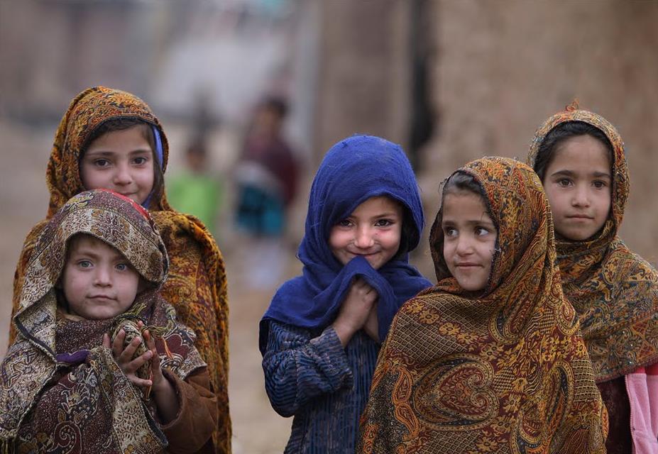
 Tried something called "Clamshell Lighting" with some volunteers from Block F. Really happy with the results. You set up lights just above and just below the face to wash the face with tons of light. The white background turns gray in comparison and vignettes (turns darker towards the corners). Used the 50mm 1.8 lens to get as narrow a depth of field as possible. Because I messed up the link last post, here's the video. Mind blown moment happens within the first 2 min. Minimalism - using the minimal amount to still get the essence of the thing. What's the one feature that captures the essense of each superhero? (Meta - what's your defining feature that captures the essence of you?) I'm loving these posters, they're even made to look old, folded and creased. There's a lot more, see how strong your comic book mojo is - see which superheros you can name. Here's the artist's page. 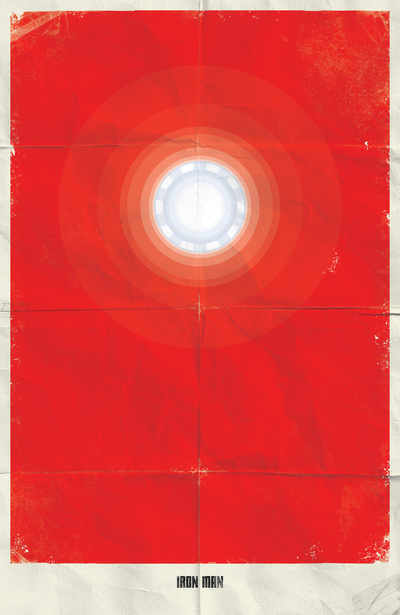 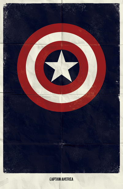 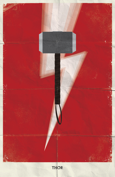 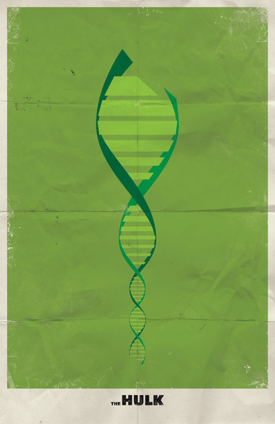 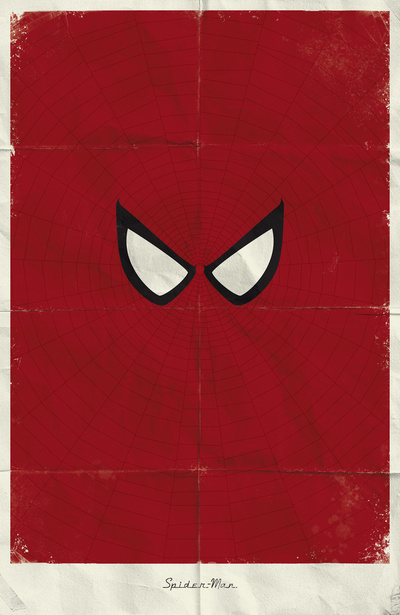 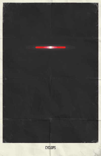  http://vitamincr.com/2012/05/3000-photos-30-days-lots-of-love-epic-stop-motion-gundam-battle/
Here's a review: 3,000 photos, 30 days, lots of love -> Epic Stop Motion (Gundam) Battle "One of the things he does really well is with adjusting the focus of the subjects in his video at the appropriate times. Not everything is in/out of focus on each single sequence: only when it makes sense. "The details he puts into the animations is key too – even things you might not immediately think is necessary. For example, the side leggings/armor of Saber Lily from Fate kept shifting up and down – even during times you wouldn’t notice. That detail and consistency is key to feeling like the whole thing was professionally put together. "Language is communicated either through body language, and when necessary, obvious punctuations as well. I think this translates well through different languages and cultures, though admittedly knowing/liking Gundam would help with the appreciation in this video. "Speaking of details, sparks and changing references for the sword part of the battle. Given how quickly things were going, I doubt losing the sparks would really draw away our attention, but he still put it in. "The slow-mo bullet was brilliant. Slow-mo within a stop motion (slow-mo) video." Artist's website is here. I love the minimalist feel to these classics. Why is it not boring instead of powerful when the colours are restricted? Maybe it's because we're assaulted by too much flashing colour the rest of the time? Or because we are subconsciously impressed that they were able to convey the meaning perfectly using so little. I guess that's the appeal of haiku too. 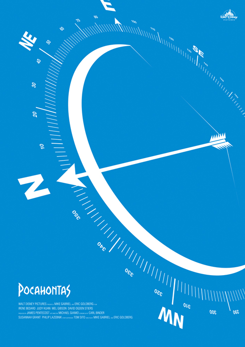 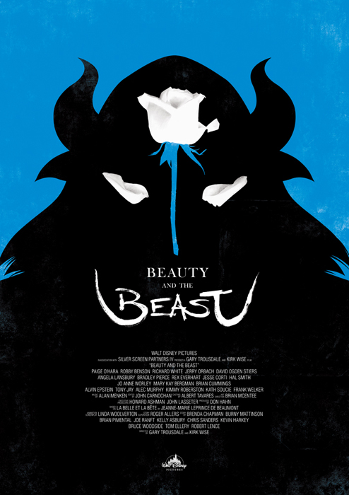 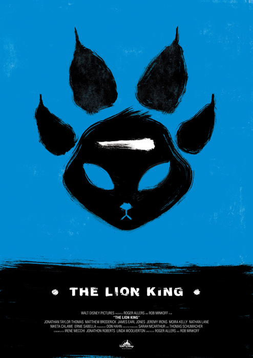  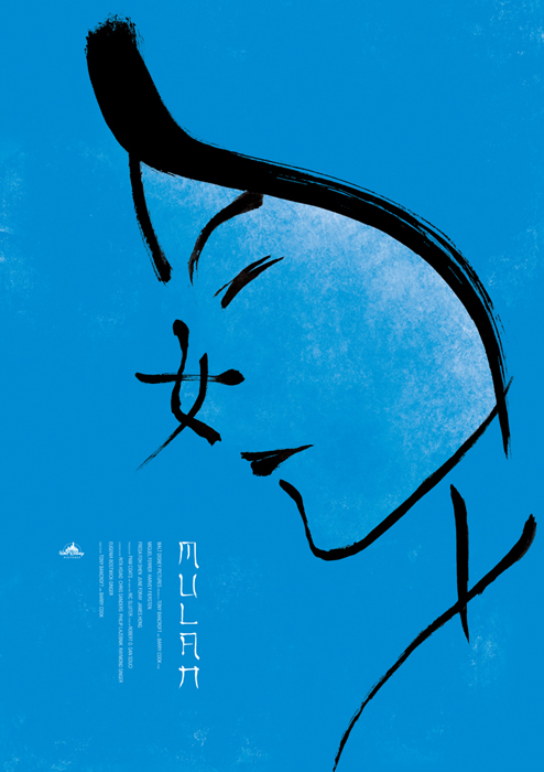 A neat video about voiceover artists : http://www.youtube.com/watch?feature=player_detailpage&v=xivQ6_gu3W8
|
This front page is for miscellaneous Media Arts things I find interesting but don't relate specifically to course work. Select the top tabs for assignments, etc.
Mr. Evans
questions? school email: Categories
All
Archives
April 2020
|


 RSS Feed