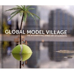
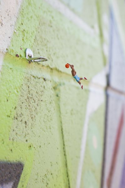
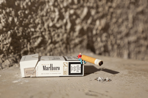
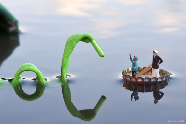
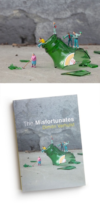
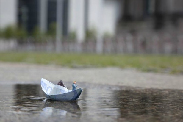
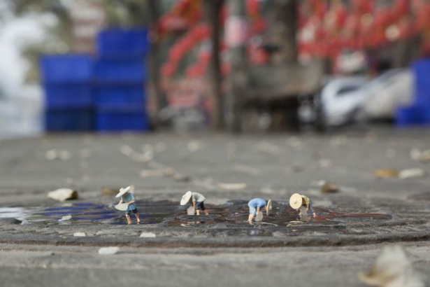
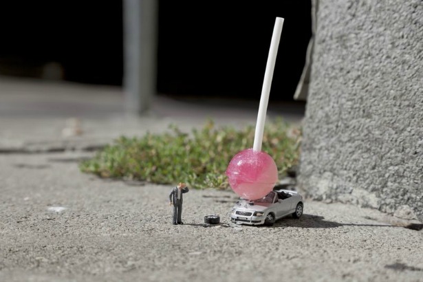
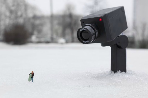
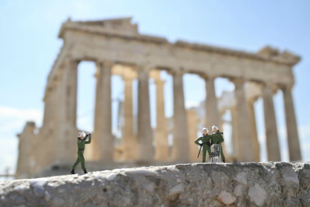
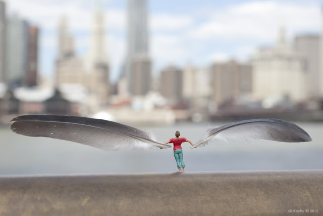
 UK street artist Slinkachu has been photographing tiny figurines he remodels, paints, and sets up in big cities around the world. Close up shots of tiny objects like these are called "macro" shots (the flower setting on the camera dial is optimized for these). His blog with more of his work is here. In his own words: "The 'Little People Project' started in 2006. It involves the remodelling and painting of miniature model train set characters, which I then place, photograph and leave on the street. It is both a street art installation project and a photography project. The street-based side of my work plays with the notion of surprise and I aim to encourage city-dwellers to be more aware of their surroundings. The scenes I set up, more evident through the photography and the titles I give these scenes aim to reflect the loneliness and melancholy of living in a big city, almost being lost and overwhelmed. But underneath this, there is always some humour. I want people to be able to empathise with the tiny people in my works. 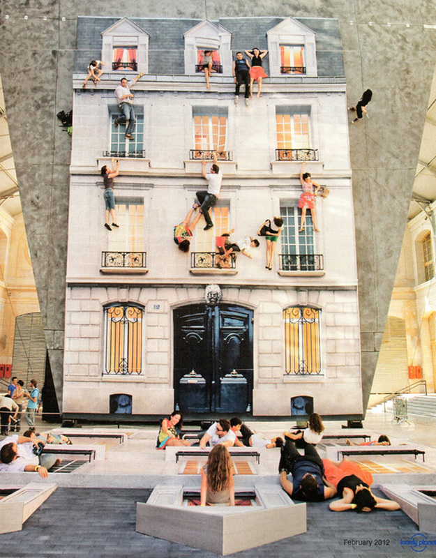 From an artist in Paris, Leandro Erlich. website here. No photoshop or other effects. If you can't see it, the bottom is the ground, made to look like the side of a building. There's a giant mirror installed at an angle above them. At the bottom left corner is some normal people.
Minimalism - using the minimal amount to still get the essence of the thing. What's the one feature that captures the essense of each superhero? (Meta - what's your defining feature that captures the essence of you?) I'm loving these posters, they're even made to look old, folded and creased. There's a lot more, see how strong your comic book mojo is - see which superheros you can name. Here's the artist's page. 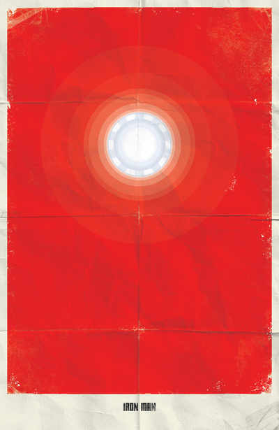 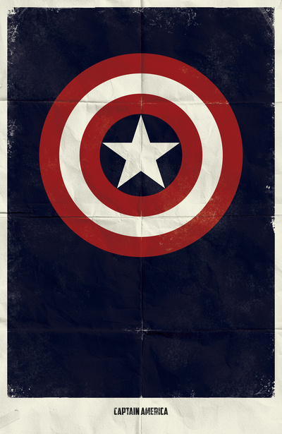 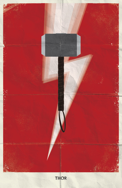 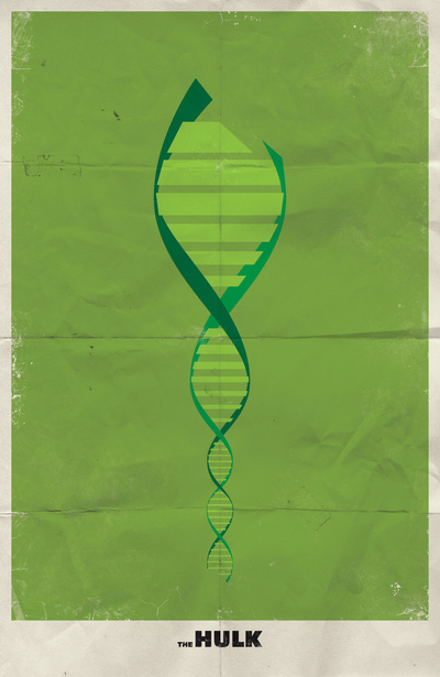 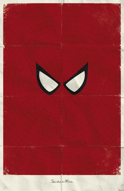 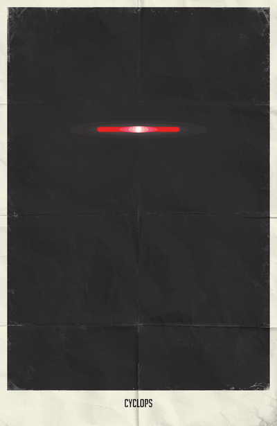 Artist's website is here. I love the minimalist feel to these classics. Why is it not boring instead of powerful when the colours are restricted? Maybe it's because we're assaulted by too much flashing colour the rest of the time? Or because we are subconsciously impressed that they were able to convey the meaning perfectly using so little. I guess that's the appeal of haiku too.     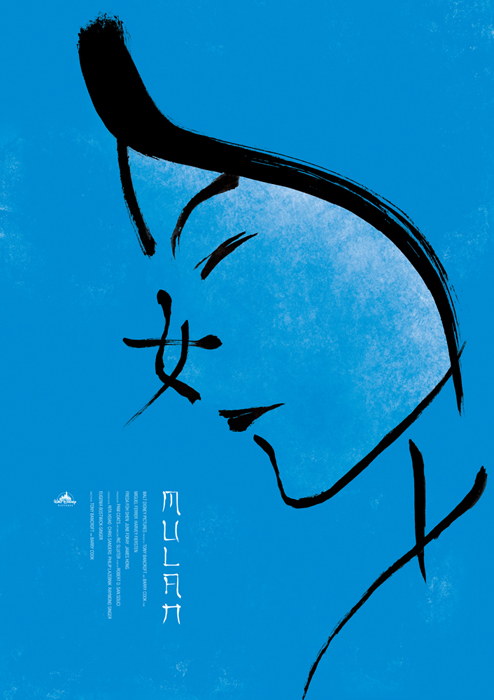 "Have you ever been to a thrift store (think Goodwill or Salvation Army) and noticed that they usually carry a small selection of landscape paintings? Artists Chris McMahon and Thryza Segal decided to inject a little fun into these discarded works and give them a second life by adding monsters to the scenic landscapes. The trick is to match the paint originally used (e.g., acrylic or oil) and try to blend the monsters into the original scene as if they were always there." I don't know why I like this so much. I'd love to see one snuck back into the store afterwards. See more examples here. 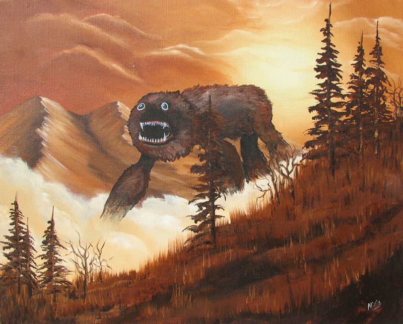 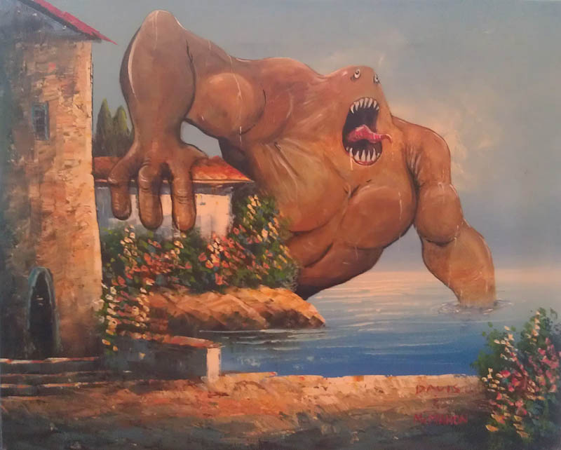 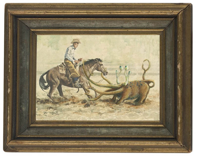  This artist showed her drawings and how they evolved from age 13-20. Click link to see the whole progression.
This reminds me of the book "Outliers" by Martin Gladwell, which suggests that becoming a master of anything depends only on 10 000 hours of time working on it, and there are no shortcuts. Whether it's a hockey player, a musician, a computer programmer, anything. Really interesting book.  Speaking of graffiti, this site was fun to play around with to design a tag without being destructive about it. And if you are that type of person that HAS to express yourself this way, the best place for it is to find walls that are set aside as public art spaces meant for them to be graffitied - at this non-criminal point, they're called murals, and artists are sometimes paid to cover up an otherwise ugly space. The best example I can think of are the multiple long walls of the overpass just as you drive into Granville Island from 4th ave. in Vancouver (the first 2 pictures are from there). I don't know if there's a way it's organized in terms of who can paint there or not. More Vancouver mural pictures on the right side of this site. 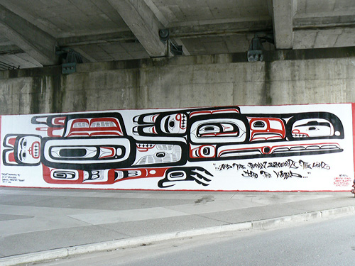 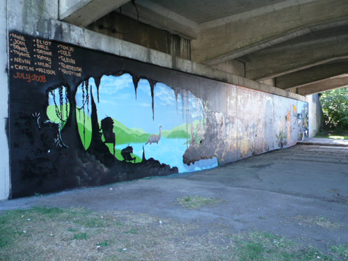 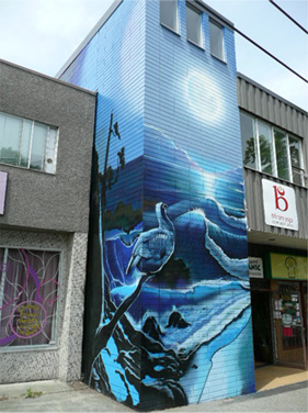 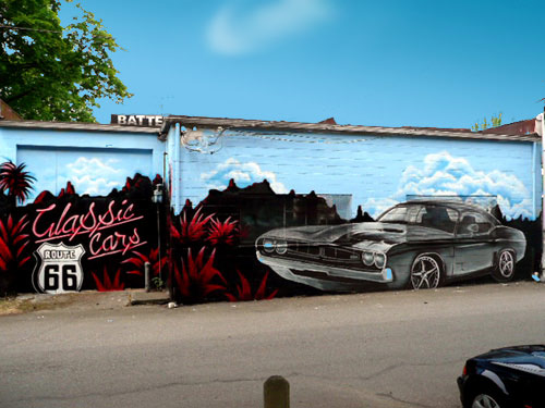 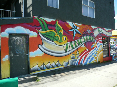 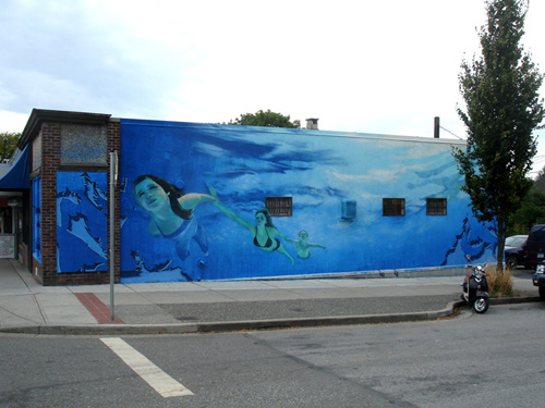 Also interesting is this idea by the Vancouver Police: A Graffiti contest:
I'm not a fan of mindless tagging or destructive graffiti. However, this stuff seems different, like art. I'm not going to try to explain the difference, because as I try I feel I'm coming up short. My favourite of the ones below is probably the statue, because at first you don't get it and then there's an AHA moment. I love those moments when understanding slides into place. The most famous graffiti artist in the world is Banksy, in England. I have a book of his in the classroom, ask me if you want to see it. The photographer and the kids below look like his kind of stuff. 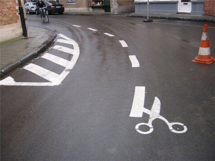 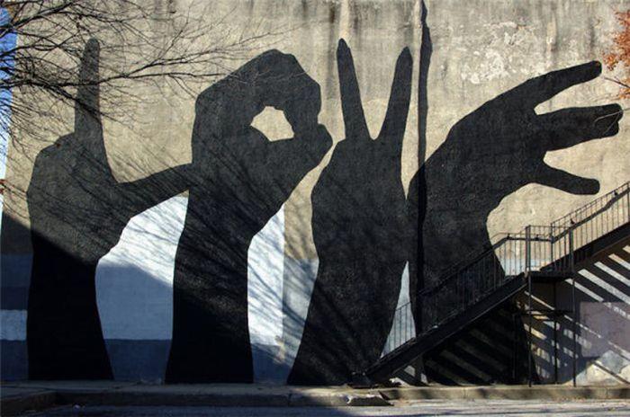 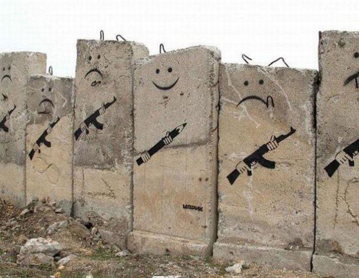 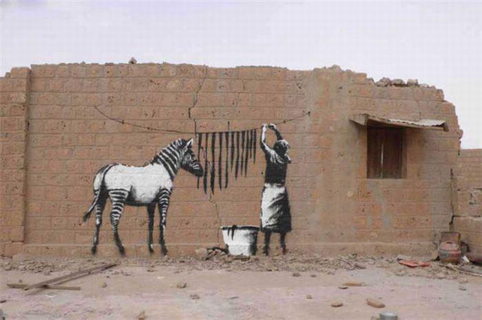 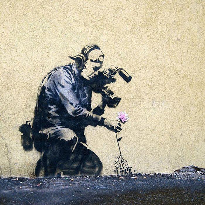 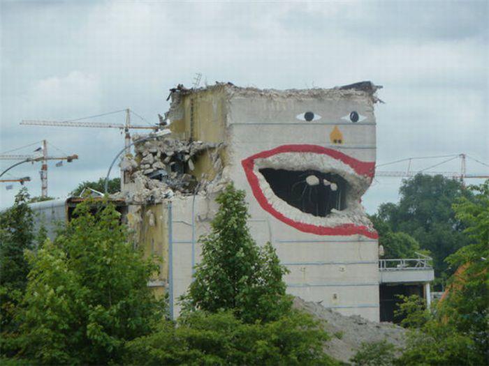 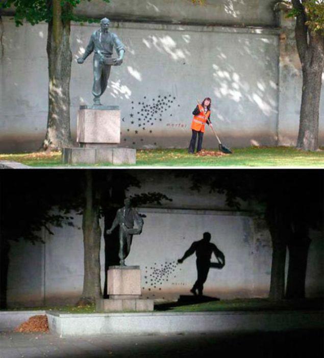 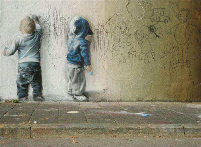 |
This front page is for miscellaneous Media Arts things I find interesting but don't relate specifically to course work. Select the top tabs for assignments, etc.
Mr. Evans
questions? school email: Categories
All
Archives
April 2020
|

 RSS Feed